
I was watching someone give a talk the other day and, like most people nowadays, they were using a projector, screen and were displaying various bits of their talk on the screen, including text and statistics that applied to their subject. I’m being deliberately vague about it all, because I don’t want to identify the person themselves. I spoke to them about it afterwards, but I’d hate to publicly embarrass them in any way.
So, they had a slide that looked like this:
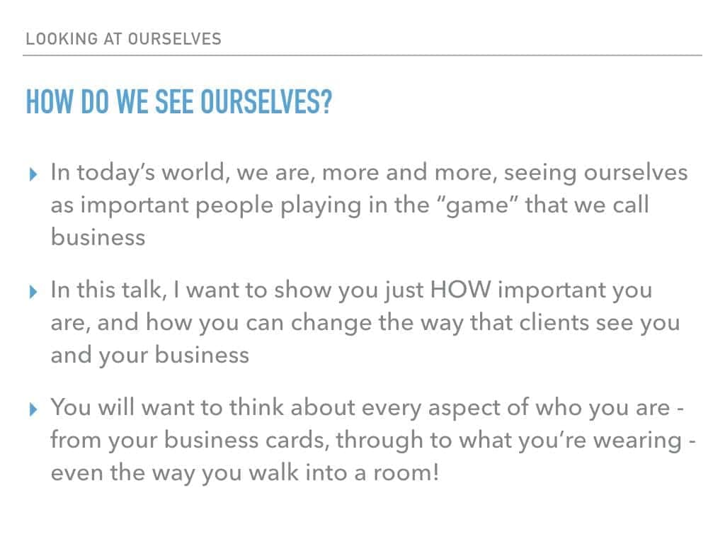
You will have seen a million of these. However, where have you seen them? If you’ve seen them on a presentation thats been emailed to you, that’s fine – but if you’ve seen them whilst someone stands in front of it with a laptop and a laser pointer – well, that’s all kinds of wrong.
PowerPoint presentations (or Keynote, or whichever program you use) are meant to be an aid. They’re meant to enliven your presentation, to add something to it. They’re not meant to be your crutch. If you’re saying EXACTLY what is on the slide, then you need to change the slide. Sadly, that’s exactly what this speaker was doing – just reading to us all, like we we’re 6-years old
If you are a compelling, entertaining speaker – you don’t need a slide presentation, apart from some very specific circumstances. If you need to show a photo of someone, to illustrate your story; to display your company logo; to highlight *one phrase* or *one word* of what you’ve just said or to show a specific infogram or statistic.
Oh, that leads nicely onto my next point.
I’ve also seen slides like this one:
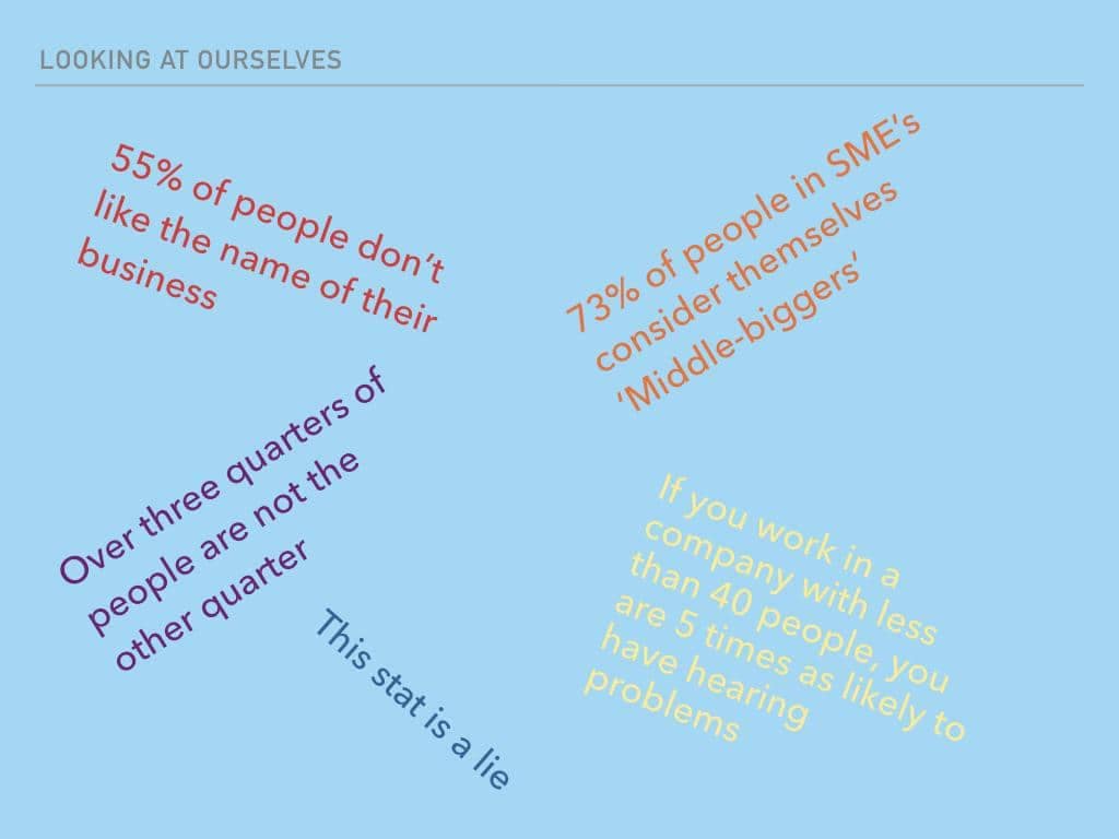
Stats, numbers, figures, quotes, percentages, fractions – all in different colours and, sometimes, different fonts. Gaahh! So frustrating.
Obviously, everything in the above slide is a load of tosh – but the presentation I was watching had *fourteen* stats on one slide. Honestly, I couldn’t recall one of them if you had me in a darkened room and shone a light in my face – and I spent time counting them!
As I tell my clients – unless you are delivering a company’s end of year results – there should be no more than THREE statistics in any one presentation. And, out of those three, how many do you think the audience take away with them? One. That’s it – just one. How can you possibly make sure that the one they remember is the one you *want* them to remember? By cutting down on the clutter.
Another way – is by talking. If you give a great speech that’s based around one phrase, one statistic, one stream of consciousness – you’re guaranteed to be remembered. And by that I mean remembered as a good speaker – not as someone who read out their PowerPoint presentation.
It’s called a ‘talk’ or ‘speech’ not a ‘read’. Get talking, and stop clicking for the next slide…